The Top New White Paper Design Trends
You know the feeling of satisfaction when you create a piece of whitepaper or eBook content that just works. You send it out into the online space, and it gets received the way you had planned and hoped. Whether it’s by successfully building engagement to move existing leads down the funnel, or generating new leads entirely, when your content hits home and does its job, you want to replicate that success at all costs. If this is your goal, investing in quality white paper design is something you can’t overlook.
At Form + Function, we’ve looked at successful content from every angle, measuring how it looks and feels. And after analyzing what makes content work, we’ve developed the philosophy that successful content is almost always rooted in smart, intriguing design. Great white paper design isn’t just something that should be an afterthought in your content creation process, it’s something that can provide your content with an appealing edge and produces measurable results in terms of engagement and lead generation.
We know this because we’ve helped tons of awesome brands achieve better white paper design and create more engaging eBooks for lead generation. Over the ears, we’ve distilled this experience into a few key trends we’ve noticed in whitepaper content that pays dividends in higher engagement and conversion rates. This blog post discusses four easy-to-implement white paper design trends that will get your content focused on smart design and readability. Following these trends can help move your company from creating the type of samely content that everyone is creating to creating content that everyone is reading and acting on.
Clickable Navigation and Interactive Features
There’s a major misconception that PDF is just a boring medium that can’t really do much. We’ve noticed that very few people expect to open an ebook or whitepaper and find cool interactive features, like clickable navigation. By adding a little creativity to your white paper design process, you can make your content function less like a static document and more like an engaging piece of web-optimized content. One way to do this is to use clickable navigation in long form content. Clickable navigation is a fairly straightforward, immeasurably convenient option for an ebook that nobody should be overlooking.
Allowing your reader to click on a table of contents or navigational tabs that will take them to the exact subject they want to read about helps maximize engagement by getting them the information they need quickly and easily. This minimizes drop-off, improves the chances that your reader will see a relevant CTA and situates your brand as innovative and savvy in the process. In addition to clickable navigation, PDF allows for a lot of other engaging features, like clickable checkboxes, fillable fields and clickable buttons that work great as CTAs. In white paper design, the little details make a big difference.

Catchy Cover Design
Everyone judges an ebook by it’s cover, so don’t miss out on your first and most important opportunity to engage your audience. A cover design should be simple and compelling at the same time: make it specific enough that your reader will understand what the topic of the whitepaper or ebook is about, while making it simple enough that they don’t get confused.
Finding the balance of what makes a catchy cover design takes practice and some trial and error, so you might want to play around with A/B testing in order to find what cover design receives more downloads for a piece of content or check out some of these white paper design examples for inspiration.

Custom Images and Infographics
When a piece of content fits firmly within your brand guidelines, there is a certain level of trust and authority that you convey to the reader. Content simply doesn’t have the same look or appeal when it is clear that infographics and data have been copied and pasted from another source. While you should always cite your sources, recreating graphics within your brand’s color guidelines can lend additional credibility to your message and elevate your brand’s image in the process.
Customizing your images and graphics will not only make your content look and feel more professional, but it will actually come back to help improve brand recall among your readers.

Smart CTAs
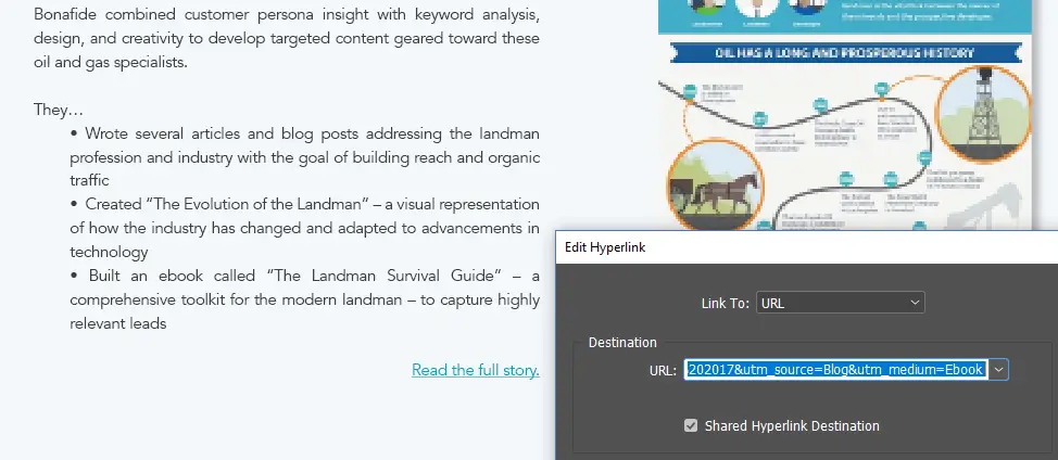
As we discussed above, there seems to be a missed opportunity to make your whitepapers and ebooks more interactive. Including smart CTAs is a great way to do this. Since whitepaper content lives on the screen, you can collect valuable data on your readers’ interests just like you would with any other piece of web content. If you use a marketing CRM, create UTMs that are specific to your whitepaper or eBook to track engagement and place them behind all of your clickable CTA buttons. Doing so is a great way to tag your leads with their interests, improve lead scoring and better measure the ROI of your content.

Web Friendly Layouts
Many people create their whitepapers and eBooks in print-friendly format, sticking to letter size paper and shunning interactive features. The reality is, the vast majority of content consumers (myself included) read ebooks or whitepapers on screen. Because they are mostly read on a device, the most important thing you can do to make your content more convenient for your reader is to create it in a web-friendly layout, like 1920×1080 (the size of most PowerPoint slides), which fills a screen much nicer than letter-sized content and will still print well for the small fraction of your audience who wants to consume your content on paper. The less a PDF “feels” like a PDF, the more your audience will want to engage with it, treating it like the rich piece of interactive content that it is.
Start Creating More Engaging Whitepaper Content Today
The space between what can be done and what most marketers are doing is where online content success lives. If you can give your reader something more innovative/convenient/helpful than they were expecting, you’ll establish yourself as an authority and make your content more delightful and engaging in the process.
If you’d like to start making your brand’s whitepaper content more engaging, get in touch. Form + Function’s creative team has worked with some of the most innovative brands in content marketing to help craft whitepaper, eBook and other visual content that generates & engages leads. We’d love to help you make your whitepaper design a more effective part of your content marketing strategy.